

A product for a social good
This was an assignment from the Google UX Design Professional Certificate on Coursera. The brief was to design a product that serves a social good. Mine was an app with a list of steps anyone can follow in an emergency, like what to do if you burn or cut yourself, until help arrives.
The project had a second purpose: to show that an app’s design elements can be extended to a website, so the same product works on a phone and a desktop.
Two challenges shaped it:
- The content had to be easy to scan during an emergency, by someone stressed and in a hurry.
- It was my first real project in Adobe XD.
Research and testing
I started with a competitive analysis. Apps in this space range from genuinely useful to overly cautious about which topics they cover and what they tell you to do. Rightly so, since these are sensitive topics.
Friends and family agreed to a moderated usability study of my wireframes and mockups. The main finding: emergency directions need to be concise, and supported by videos that show the technique being described.
First aid isn’t something I think about often, so I leaned heavily on an offline survival guide for reference. Seeing how someone else had organized this kind of information was a big help.
Designing for Lisa
The persona was Lisa, 25, who works in sales. She loves the outdoors and takes her family camping whenever she can. She worries about not knowing what to do in an emergency, and she uses apps like this one to feel prepared.
Sketches to mockups
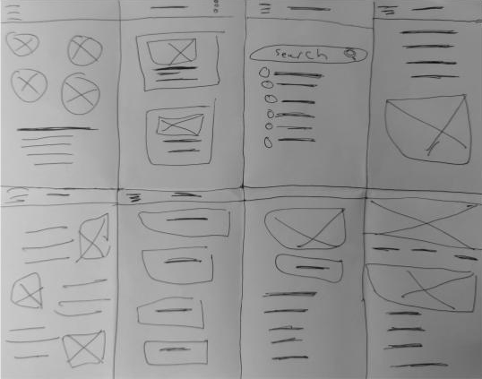
After the research, I worked through many sketches and interaction notes before settling on the design below.
The app opens on a list of topics, from a minor cut to heat stroke, each with an icon. A Contact Emergency / 911 button sits at the bottom of the list. Each topic is a short series of numbered steps, followed by a demonstration video.


The same components carried over to the desktop site.

What I learned
- Design systems pay off when you scale up. Going from a small screen to a large one, a shared system saved time and kept the two consistent.
- An app like this needs careful language, both to be genuinely helpful and to stay on the right side of legal risk.
Next steps
New technology like augmented reality could take an app like this much further. Closer in, it needs a longer list of topics, and a way to save the videos for offline viewing when you’re off the grid.