
Practicing the whole process
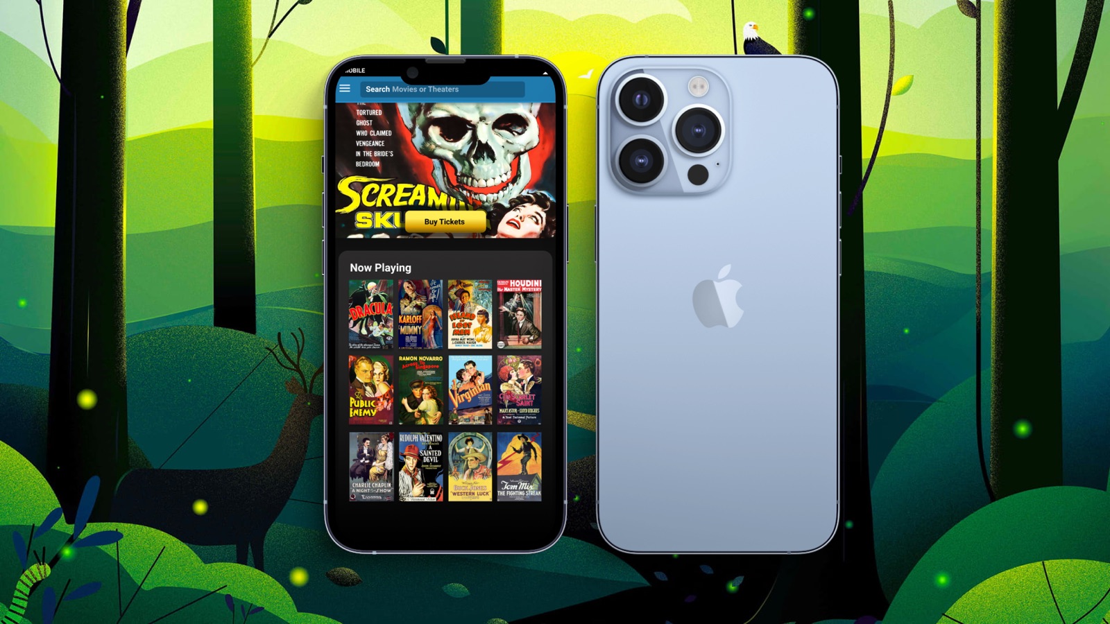
This was an assignment from the Google UX Design Professional Certificate on Coursera: a mobile app for buying tickets at a fictional local movie theater.
Why build something like this? The point was to commit to all five stages of design thinking, empathize, define, ideate, prototype, and test, and to carry each one out in full.
There was a tool to learn as well. I knew Figma only in passing and had never used it professionally. I used it for everything on this project, and I’ve loved it since.
My first moderated usability study
To learn about the people who’d use the app, I recruited friends and family who buy movie tickets on their phones, for my first moderated usability study.
I learned a lot, mostly about how people expect apps like this to behave, based on the ones they already use. I didn’t expect the amount of feedback I got. People genuinely like to help, and they aren’t shy about their opinions.
Sandra and Bill
Two personas came out of the research:
- Sandra, 22, a sales agent and single mother, wants a quick, easy way to buy tickets on the go for herself and her two kids.
- Bill, 30, works retail with odd hours. He’s a movie buff who catches a film when he can, and buying tickets on the go means he sees more movies a year.
Both are on their phones, short on time, and fitting a movie into a tight schedule. The flow had to be short.
Sketches to screens
Once I understood what the product was and what it needed to be, I sketched wireframes and concepts until I settled on the final layout.

The finished flow is four screens. Browse what’s playing, open a movie to see its details and pick a showtime, choose seats on a map of the theater, and get a QR code to show at the box office.


What I learned
- Figma. I used it exclusively for this project, and by the end my skill with it matched what I had in other vector tools like Illustrator and Affinity Designer.
- People like to help. Participants gave thoughtful feedback even about things they had no real interest in. They simply wanted to be useful.
Next steps
A membership program and ordering concessions in the app are the natural next features.