

Email as a to-do list
Most email apps treat the inbox as a pile of messages. Inbox by Gmail, which Google launched in 2014, treated it as a list of things to deal with. Every email had a check mark. Shipping notices and receipts folded into a single “Purchases” row. You could snooze a message until tomorrow, pin the ones that mattered, and sweep away everything else in a day with one click. When the list was empty, you got a sun and the words “All done.”
Google shut Inbox down in April 2019 and folded a few of its features into Gmail. The features survived. The idea didn’t. Gmail still shows email as messages to read, not tasks to finish.
To me, Inbox was simply the better way to do email. Treating every message as a task to finish made it easier to work through a full inbox: I wasn’t reading a pile of messages, I was clearing a list. That’s the experience I wanted back.
What I borrowed
I started from two products. Mimestream is a native Mac Gmail client with a familiar three-pane layout: mailboxes, the message list, and the open conversation. Inbox supplied the behavior: bundles, Done, Snooze, pins, date sections, and “highlight” cards that pulled the useful part out of an email, like a delivery date or a flight time.
I also found Inbox Reborn, an open-source browser extension that restyles Gmail to look like Inbox. It’s a good record of how Inbox actually behaved. It also showed me the limits of that approach: it depends on the layout of Gmail’s web page, works best in English, and can’t see Gmail’s own categories, so users have to recreate them by hand.
A real app, not a skin
The extension route has one big advantage. It runs inside your own signed-in Gmail tab, so it never needs Google’s approval. A standalone app that reads your mail needs permissions Google classes as “restricted,” and releasing one to the public means a paid security review.
I chose the standalone app anyway. An extension is a coat of paint on someone else’s product, and it peels whenever Google changes the page. An app built on Gmail’s API can keep a local copy of your mail, work offline, sort mail into smart bundles, and run snooze itself. During development it stays in Google’s testing mode, which is limited to 100 users. That’s fine for a portfolio project, and it’s an honest constraint to state up front.
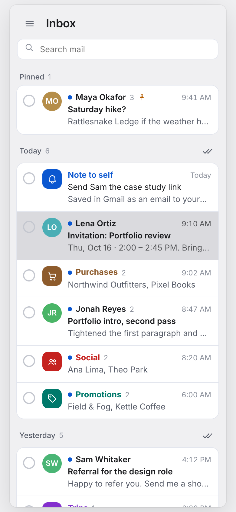
That left one principle to design against: every email is a task. Each row gets a round checkbox instead of Gmail’s square selection box, because a circle reads as a to-do and a square reads as “select this.”
Four versions in two days
As with Calliope, I didn’t hand-write the prototype. I directed Claude Code, an AI coding agent, which built each version as a working web page while I made the design calls. Each version was a complete inbox with sample mail, and I could click through it within minutes of asking for it. That changed the pace. I wasn’t comparing sketches. I was using four different email apps.
It also changed what I could judge. The whole idea of Iris lives in interactions: how it feels to check something off, whether a bundle is easier to clear than five separate emails, whether a sweep feels satisfying or risky. A static mockup can’t answer those questions. A working prototype answers them the first time you click. And because each version took minutes rather than days, throwing one away cost nothing, which made it easy to keep the good idea from each round and drop the rest.

The first version put Inbox’s features into Mimestream’s layout. It worked, but it read as another Mac mail app with a few extras. The task idea wasn’t visible at a glance.

So I asked for something closer to Gmail, because that’s what people already know. This is where the round checkbox arrived, along with a progress count (“8 to do · 3 done today”) and reminders mixed in with mail. It was the first version that felt like a to-do list. It also felt like a web page, not a Mac app.

Version three went back to three panes, with Google’s current visual style: soft tinted surfaces, rounded groups and a progress ring. It had everything, and that was the problem. Every row carried chips, cards and buttons. I also moved Compose from a floating button to the top of the sidebar, where people look for it on a Mac.
Labels, not bundles
Inbox had a sidebar section called “Bundled in the inbox.” My first versions copied it. Then I asked a simple question: wouldn’t these just be labels, to match what Gmail calls them?
That reframed the feature. A bundle isn’t a different kind of thing. It’s something a label does. In Iris, every label, whether it’s one of Gmail’s categories, a smart label like Purchases, or one you made yourself, has a “Bundle in inbox” switch. Turn it on and that label’s mail collapses into one row, which counts as one task. Nothing new to learn, and everything stays in sync with Gmail on your phone and the web.

Taking it into Figma
Once the behavior felt right, I took the design into Figma to work on the look myself.

Most of what I changed was taking things away. The sidebar became flat gray. Compose became a plain white card. Pinned mail got its own section at the top instead of floating within each day. The rows lost their label chips and preview cards, and bundles got solid color tiles that you can find without reading. I sent the frame back, and the prototype was rebuilt to match it.
What the prototype does
The prototype at the top of this page is the final version. It runs on sample mail and isn’t connected to Gmail, but everything in it works:
- Check things off. The circle fills, the row strikes through and slides away, and Undo is there if you need it. You can check off a single email, a whole bundle, or everything left in a day.
- Snooze until later today, tomorrow, the weekend, next week or “someday.”
- Pin what matters. Pinned mail stays at the top and survives a sweep.
- Open a bundle to see what’s inside, or switch bundling on for any label.
- Answer invitations without opening your calendar.
- Undo send. Every message waits 10 seconds before it goes.
- Use the keyboard:
jandkto move,eto check off,sto snooze,pto pin,zto undo.



Decisions I'd defend
- A standalone app instead of a browser extension
- An extension skips Google's security review, but it breaks whenever Gmail's page changes. An app that talks to Gmail's API is sturdier and can work offline.
- Bundles are Gmail labels
- Any label can be switched to "bundle in inbox." Nothing new to learn, and it all stays in sync with Gmail on your phone and the web.
- Done means archive
- Checking an email off removes it from the inbox, exactly like Gmail's archive. Nothing is deleted, and Gmail elsewhere shows the same result.
- Reminders are notes to self
- A reminder is saved as an email to yourself, so it appears in Gmail on every device without a second integration.
- Nothing in the list but the email
- Label chips and preview cards made each row busier than the email it described. They moved into the open conversation.
What it would take to build
The prototype answers the design questions. It doesn’t answer the hard engineering ones, and I’d rather be clear about which is which. Building the real app means:
- Keeping a local copy of the mail in step with Gmail while you also use it on your phone. This is the hardest part.
- Showing HTML email safely, and blocking the hidden images senders use to see when you’ve opened a message.
- Filling smart labels like Trips and Purchases, which Gmail doesn’t provide. Some senders include structured data, and the rest need sorting rules or AI.
- Running snooze in the app itself. Gmail has no snooze that other apps can use, so snoozed mail comes back only while Iris is running.
My estimate is about two weeks for a first version (signing in, the real inbox, checking things off, replying and undo send) and five to eight weeks for everything on this page. That first version is the next step. After that, the step I skipped this time: putting it in front of people who still miss Inbox, and watching them clear a real inbox with it.