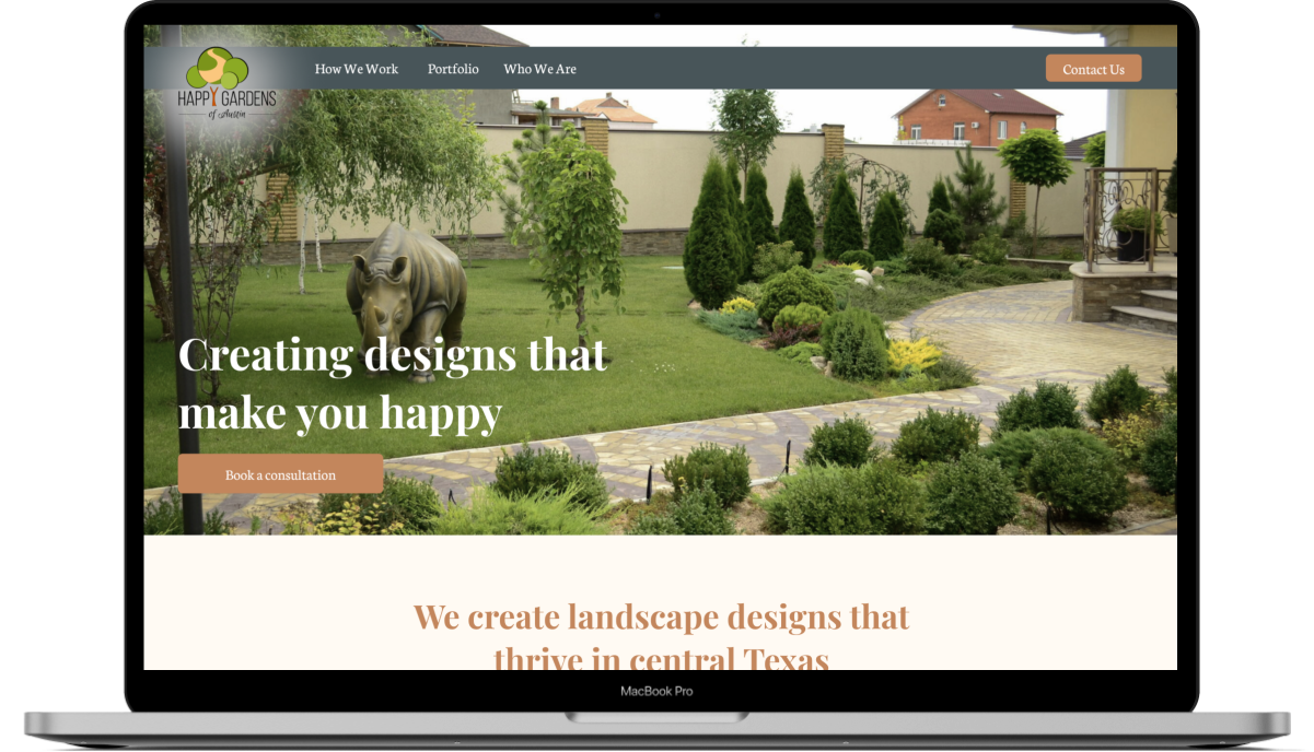

As part of a team of UX designers, I contributed to the entire process of a redesigned website for Happy Gardens of Austin.
Time - 3 Week
Tools

Happy Gardens of Austin (Redesign)
Summary
We were asked to redesign the Happy Gardens of Austin website. Hanna was aware that the current iteration of her company's website was not serving her well. In fact, her Instagram is where most of her business currently comes from.
During the research phase of this project, we narrowed down the key issue with the existing website to one of two problems. First, the information architecture users could not find the information they were seeking. The content of the site itself was unclear messaging about what services Happy Gardens of Austin as a business actually provides was lost.
The Process

The Begining
Heuristics Evaluations
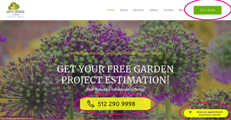
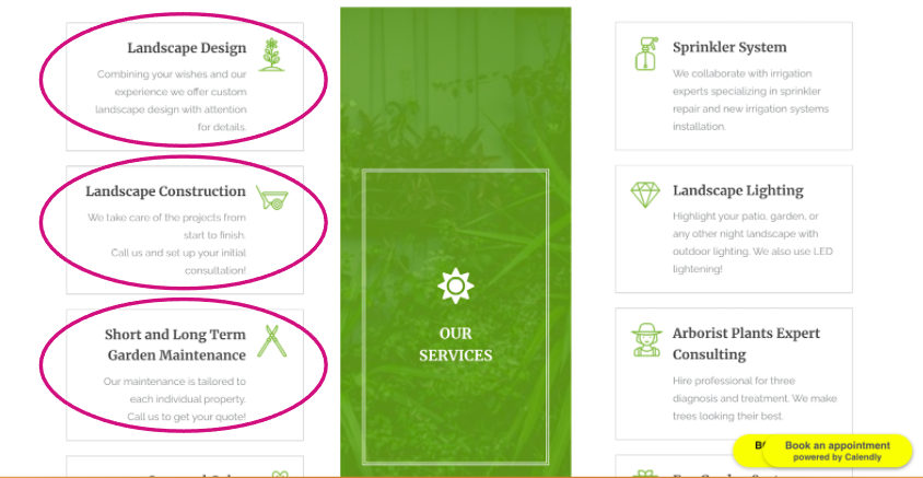
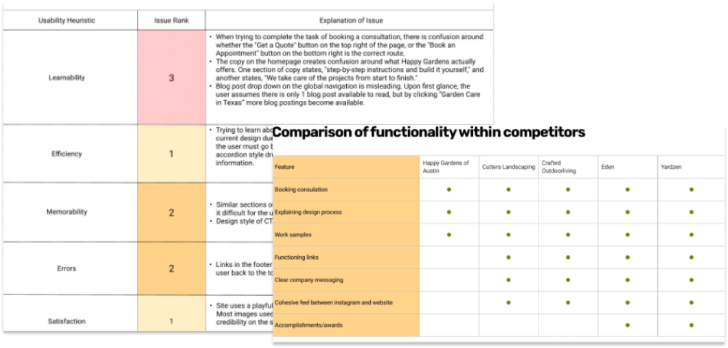
we objectively evaluated the quality and effectiveness of the current iteration of the website and made determinations about what we believed to be the problem and made a hypothesis - we concluded that content and how it was organized was the problem.
Usability Testing
Deciding on the best method to verify and test our hypothesis we conducted four usability tests that confirmed our hypothesis that the website messaging with chaotic and unclear and that the site could benefit from better information architecture and new concise content overall.
The incorrect assumptions about what services Happy Gardens of Austin provided, caused in part by differing bits of copy around services provided was compounded by where and when the variations of copy could be found throughout the site.
Comparing ourselves to others
Trying to get an understanding of how information of this type is typically expressed and organized we decided to do a Competitive Analysis. This analysis allowed us to see a few effective design patterns that emerge from the fray. Chief among them was what we internally called the "puzzle pieces" - but practically it was simply just a list of steps in a process that was organized numerically that ended with a step where a deliverable was described.
If the "puzzle pieces" were chief among the patterns we saw, a portfolio of case studies featuring past work was number two — Both these patterns were absent from the then-current site.
Who are our Visitors? (Persona)
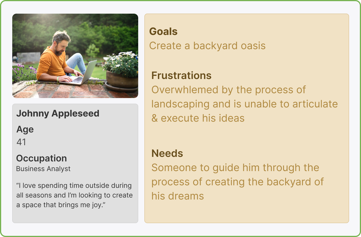
How can we make things easier for Jonny?
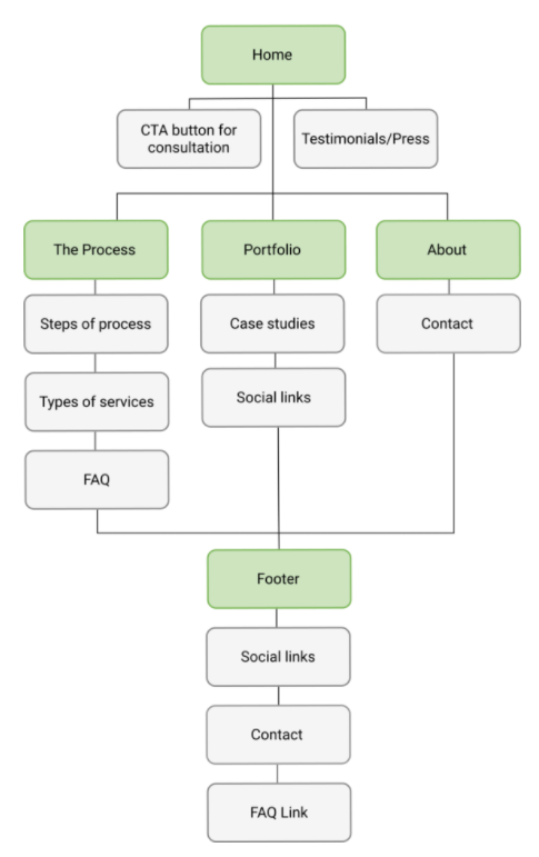
A refresh of the website's information architecture made for a better experience, making the content easier to consume and digest.
Eliminating the Blog
The biggest change for this site in terms of content came in the elimination of the blog. It was something that wasn't serving the user as it was poorly organized rarely updated and infrequently visited.
The Addition of a Process Page
One of our client's challenges was that people who contacted her via the website needed more of an explanation about what exactly her process entails. So we decided on the addition of a page that explains the process would help eliminate this client's frustration with this challange.
Developing Wireframes
After deciding where the content would live and how it would be organized we turned out attention to laying those pages out as wireframes.


Deciding on Style
After looking at competitors and evaluating the brand colors developed by Happy Gardens of Austin. As a team, we settled on the following style and created this Guide.
Reaching High Fidelity
After deciding on an agreed-upon style we started work on the hi-fi mockups, making use of the colors, font, and components from our design system.
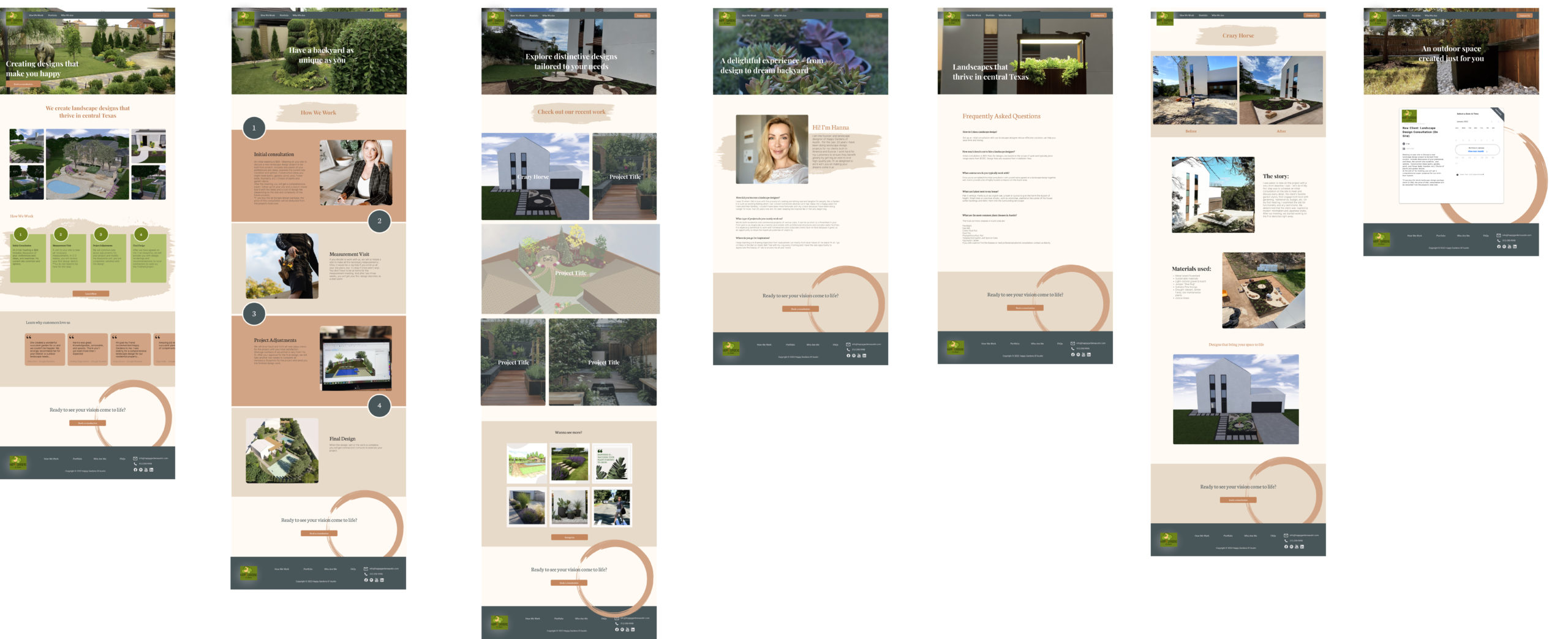
High fidelity Prototype
